Blinkle AI is an AI-powered job search platform that helps users
build and optimize their resumes, then auto-apply to matched
positions. As the product moved from alpha toward a public V2
launch, the existing homepage lacked the visual clarity and trust
signals needed to convert new visitors into registered users. The
goal was to redesign the homepage by aligning business objectives
with user needs — within the constraints of a limited budget,
minimal data, and a one-month timeline.
3 month, 4 projects
What did I work on?
Interview Intelligence Hub
Data hub + Marketplace Resources
Home page redesign
Landing page redesign for V2 public launch
Dashboard Redesign
Core product dashboard UX redesign
Project 01
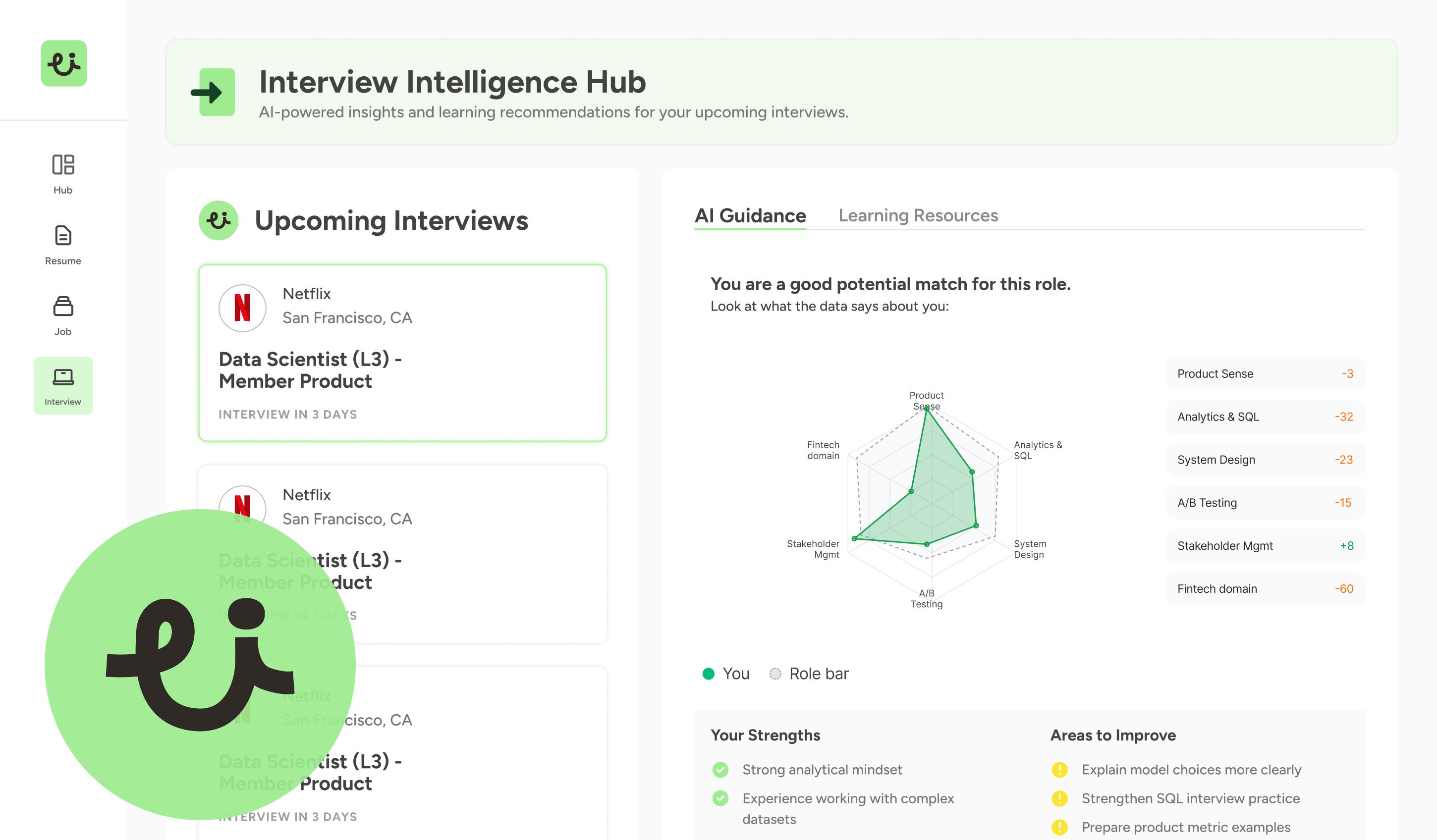
Interview Intelligence Hub
Overview
The Interview Intelligence Hub is a centralized data resource and marketplace that connects hiring teams with structured interview insights, evaluation frameworks, and curated toolkits — enabling faster, more consistent hiring decisions.
Challenge
Hiring teams lacked a unified place to find vetted interview resources. Existing tools were fragmented, inconsistent in quality, and difficult to adapt to specific roles — leading to inefficient processes and inconsistent candidate experiences.
Solution
Designed a structured hub that separates data intelligence from marketplace resources, surfacing relevant content through role-based filtering and progressive disclosure — reducing decision fatigue while improving resource discovery.
My Role
End-to-end product design: information architecture, wireframing, interaction design, and final UI. Collaborated with product and engineering to validate feasibility within sprint constraints.
Project 02
Home page redesign
Add your content here for the Home page redesign project.
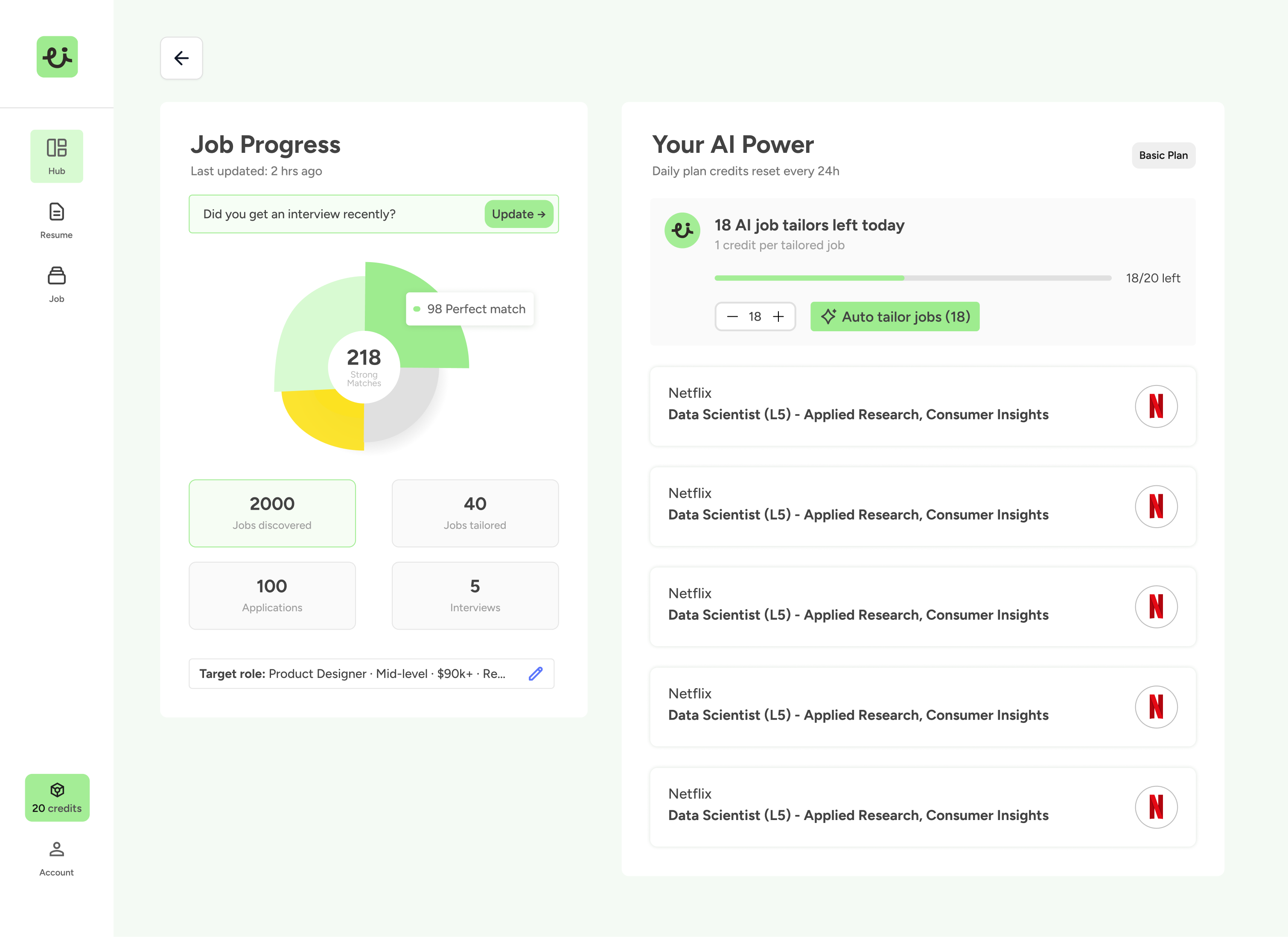
Project 03
Dashboard Redesign
Add your content here for the Dashboard Redesign project.
Design
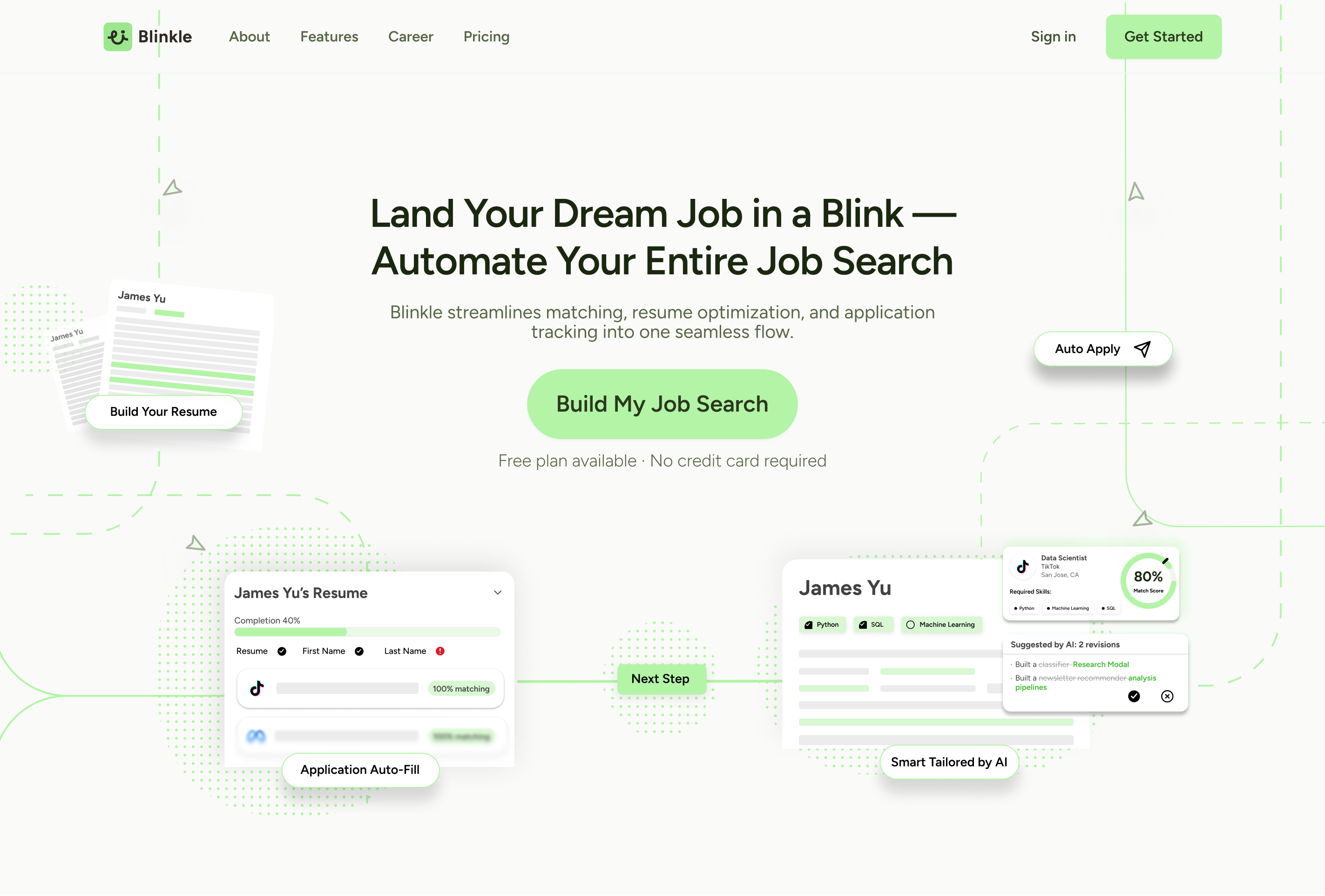
Landing Page Redesign
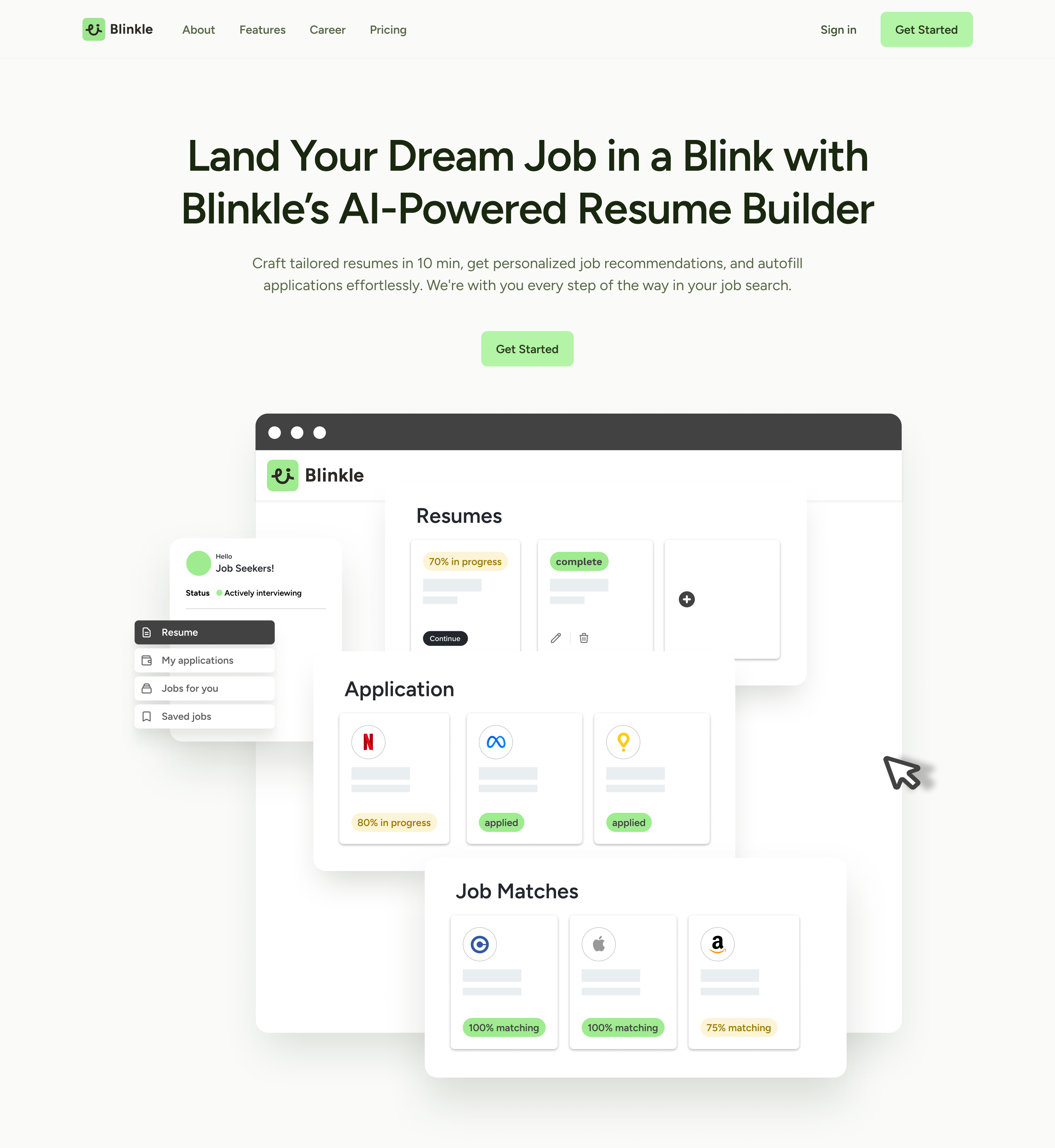
Before
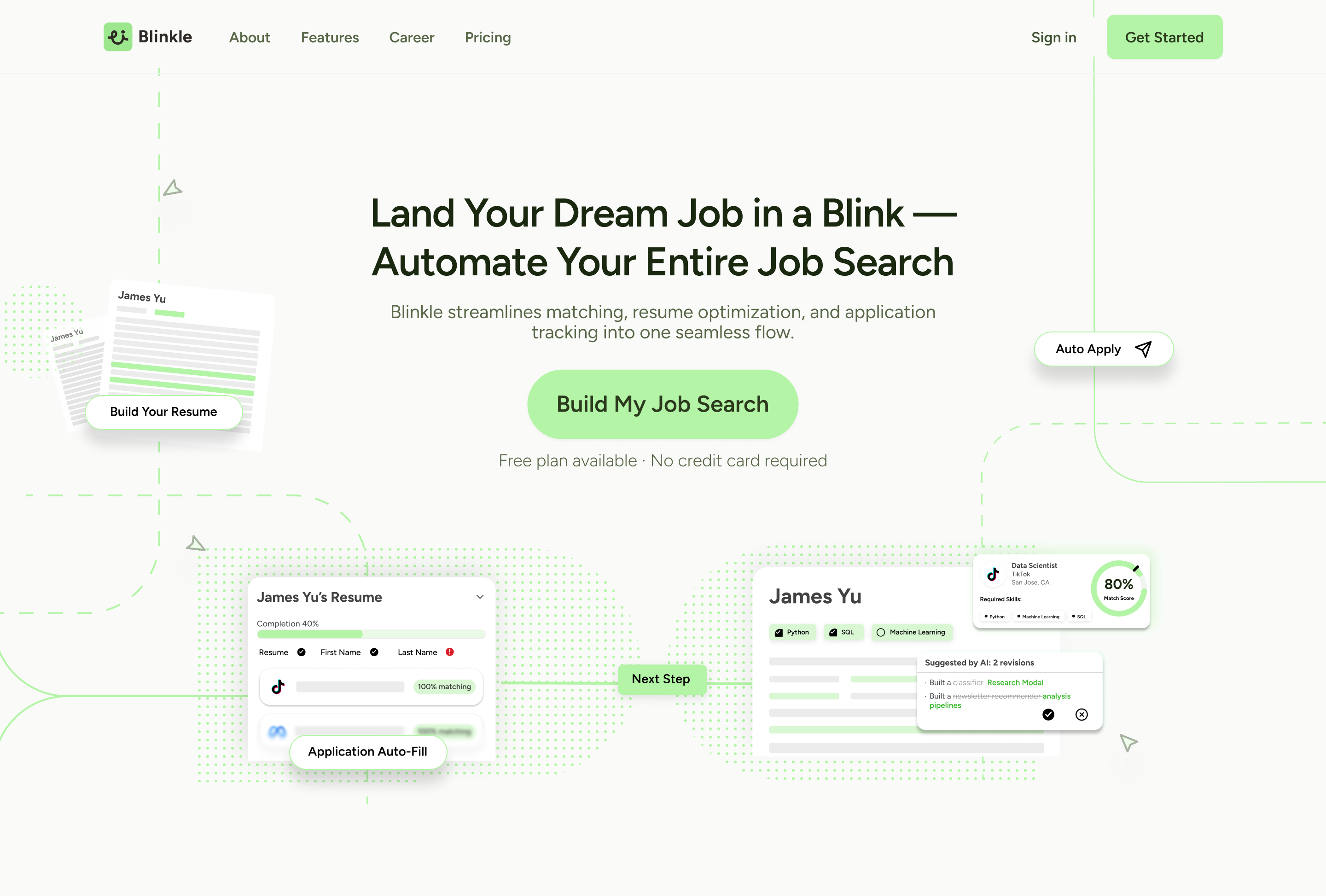
After
Design
Key Contribution
Led the end-to-end redesign of Blinkle AI's landing page
Conducted a UX audit of the existing landing page and main
dashboard
Optimized the onboarding experience to help users to adapt
Product strategy discussions around AI credit usage, credit
management, and business plan
Overview
Reducing Cognitive Friction to Drive Homepage Conversions
Blinkle AI is an AI-powered job search platform that helps users
build and optimize their resumes, then auto-apply to matched
positions. As the product moved from alpha toward a public V2
launch, the existing homepage lacked the visual clarity and trust
signals needed to convert new visitors into registered users. The
goal was to redesign the homepage by aligning business objectives
with user needs — within the constraints of a limited budget,
minimal data, and a one-month timeline.
Challenge
How might we lower the cognitive barrier for new users so they
understand Blinkle's value and take action — even without prior data
or social proof?
Constraints: limited resources · limited budget · early-stage
product · lack of data support
Research
Step 1: Understand the business & design process
Define the design framework
The project followed five phases: understanding business goals →
competitive analysis → design audit → design tradeoffs &
recommendations 1.0 → final design solution.
The overarching business goal: by optimizing the homepage's visual
hierarchy and trust-building mechanisms, reduce new users' cognitive
barriers and increase homepage registration conversion rate. Three
focus areas drove this:
Optimize visual hierarchy and CTA design
Clarify how the product workflow is presented
Convey product credibility through design language itself
Research
Step 2: User testing
What users actually do on the page
Context: 5 users (university students, 18–25)
freely browsed the homepage prototype and shared first impressions.
Behavior was layered with HubSpot mouse-dwell data for analysis.
Finding: users' mouse dwell concentrated in the
Hero section, averaging 18 seconds.
Insight: the hero attracted sufficient attention,
but lacked clear action guidance. New users most wanted to know
"what's next" — the step after landing on the page.
"I know the general direction, but I'm not quite clear on the
steps — how do I actually use this?" — Juliana Silva, 25,
Freelancer
Research
Step 3: Competitive analysis
Benchmarking against Simplify and Teal
On workflow guidance, Simplify was weak, only showing main features
without a step-by-step feel. Teal excelled with a sticky tab nav and
synced screenshot scrolling. On registration conversion, Simplify
built trust through testimonials and company logos near the CTA;
Teal had a more prominent CTA but less social proof. On AI
differentiation, neither fully committed: Simplify didn't highlight
AI capabilities at all, while Teal showed AI resume building but not
job-specific tailoring.
The key lesson from hero UX writing: Teal's result-oriented,
number-driven copy ("Land 6X more Interviews") outperformed vague
one-stop messaging.
Research
Step 4: UX/UI audit
Six core problems with the existing homepage
The CTA lacked visual prominence.
The hero image was oversized without being persuasive.
Colors were used inconsistently for different semantic meanings,
causing confusion.
The headline didn't define the target audience or the product's
position.
There was no social proof, no quantitative data, and no visual
hierarchy to direct attention.
UX language was also inconsistent across sections, with design
failing to communicate specific, concrete information.
Key Insights
Four patterns shaped the redesign direction
Visual: unclear text hierarchy created confusion
between primary and secondary information — especially for
non-native English speakers who rely more heavily on visual
structure than linguistic cues.
Language: poor clarity across different literacy
levels. UX copy was inconsistent and didn't guide users who were
unfamiliar with AI job tools.
Trust & Credibility: the absence of social
proof, user data, and quantitative signals weakened perceived
safety and credibility for first-time visitors.
Workflow Clarity: users couldn't confidently
identify what the product did or how to start. A clear
step-by-step flow representation was needed to reduce drop-off at
the hero stage.
Solution
Design tradeoffs
Given the early-stage context and the user finding that people
needed to understand fast, two key tradeoffs shaped the final
direction: cleaner visual hierarchy over feature visibility, and
fast understanding over full-storytelling flow.
Solution
From insights to design
The final V2 design addressed each problem area with a concrete
decision.
The hero copy was rewritten with outcome-focused language and a
single prominent CTA with low-friction reassurance ("Free plan ·
No credit card required").
The homepage now visualizes Blinkle's four-step workflow directly
— answering "how does this work?" before users need to ask.
Feature sections were redesigned as card-based UI snippets showing
real output states like resume completion percentage and job match
scores, making AI capabilities tangible.
A unified color system was established so green consistently
signals progress, removing semantic ambiguity.
Social proof, job count indicators, and match scores were embedded
throughout to build confidence without requiring testimonials.
Pricing tiers were redesigned with descriptive subtitles and a
highlighted recommended plan, reducing the psychological risk of
committing for first-time users.