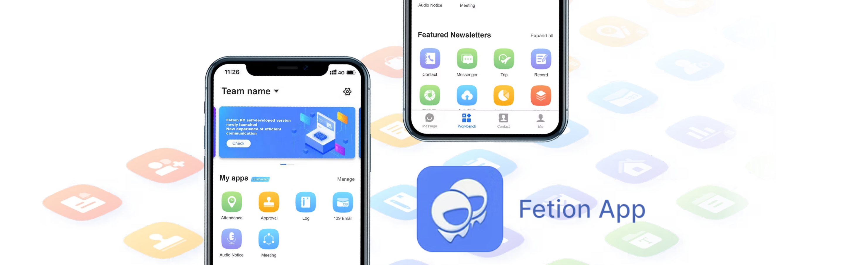
Fetion is an enterprise communication app developed by China Mobile that allows users to send and receive SMS messages between PCs and mobile phones for free.
This project focuses on the enterprise version for employees, specifically the application mall, where staff can access and manage the tools they need for their work.
To better understand the usability issues in the Fetion App Mall, I conducted a quick UX audit based on main user research insights, backend feedback logs, and user complaints gathered across multiple channels.
|
What
|
Impact
|
How to improve
|
|
|---|---|---|---|
|
High-friction workflow
|
The old userflow for installation causes unnecessary delay. Adding an app requires multiple manual steps:
Contacting customer service
→
Writing a request
→
Waiting for higher-level approval
|
|
Build an automated workflow that filters low-risk requests and lets admins approve in one click — removing the customer service bottleneck. |
|
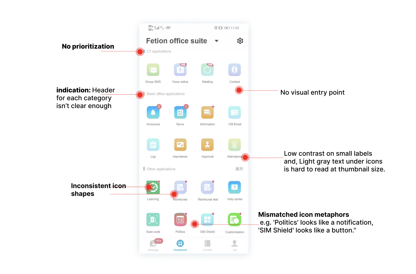
Fragmented visual design
|
The indicator for apps/functions are unclear. Same color and design for different features shows up in the marketplace. Lack of design guidance in the early stage of this app.
 eg. reimburse and reimburse test uses the same indicator
|
|
Establish a standardized design system with unified icon, color, and layout guidelines for all admin uploads. |
|
Poor info architecture
|
Insufficient spacing, weak prioritization, and no clear visual grouping make the marketplace hard to scan. |
|
Redesign the navigation with clear categories, and introduce stronger visual hierarchy through spacing, color, and typography. |
Focusing on where user complaints came in the most — the application marketplace page — I conducted a visual audit and found weak layout hierarchy and unregulated icon uploads, which together created a cluttered, inconsistent experience.
Adding an internal app required multiple manual steps and customer service intervention, creating unnecessary workloads for both users and support teams.
The app store lacked clear hierarchy and intuitive navigation, making it hard for users to find the tools they were familiar with.
Without standardized guidelines, icons, colors, and layouts varied across the platform, creating a cluttered look that hurt usability and trust.
Solution description goes here.